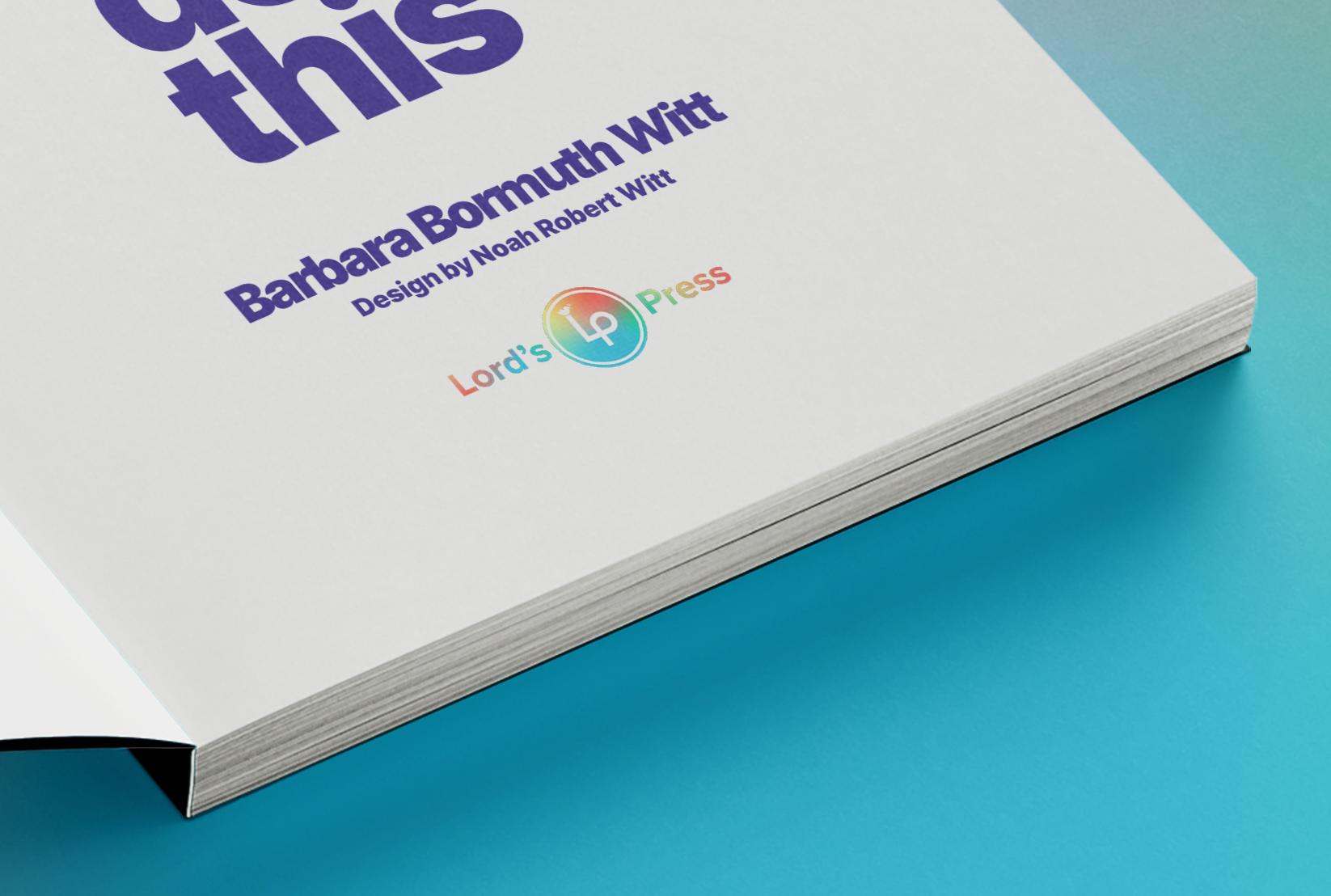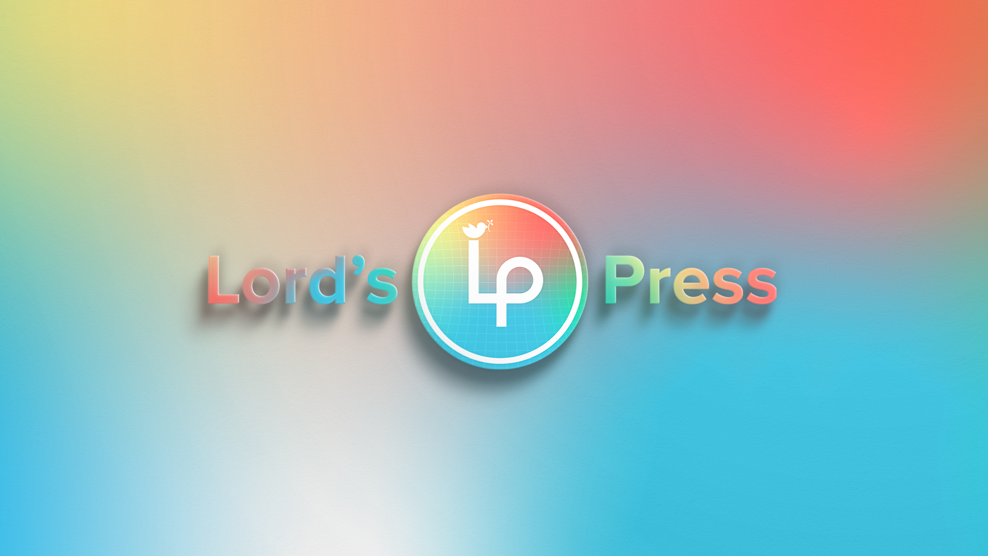
Lord's Press is a publishing company and brand that creates materials to help families build godly character. Our goal was to develop a logo that was recognizable and friendly while communicating the heart of the company.
We accomplished this by using clean lines, corners, and curves in the "LP"—symbolizing both the clarity of the company, as well as its approachable spirit. The colorful gradient was chosen because it conveys the joyful family-friendly spirit that runs throughout the company's materials. It also alludes to the diversity of the curriculum, videos, and other materials that Lord's Press creates. Finally, it is topped off by a dove with a branch in its beak—emphasizing the role of the Holy Spirit in the life of Christians to build Christ-like character in the hearts of families.