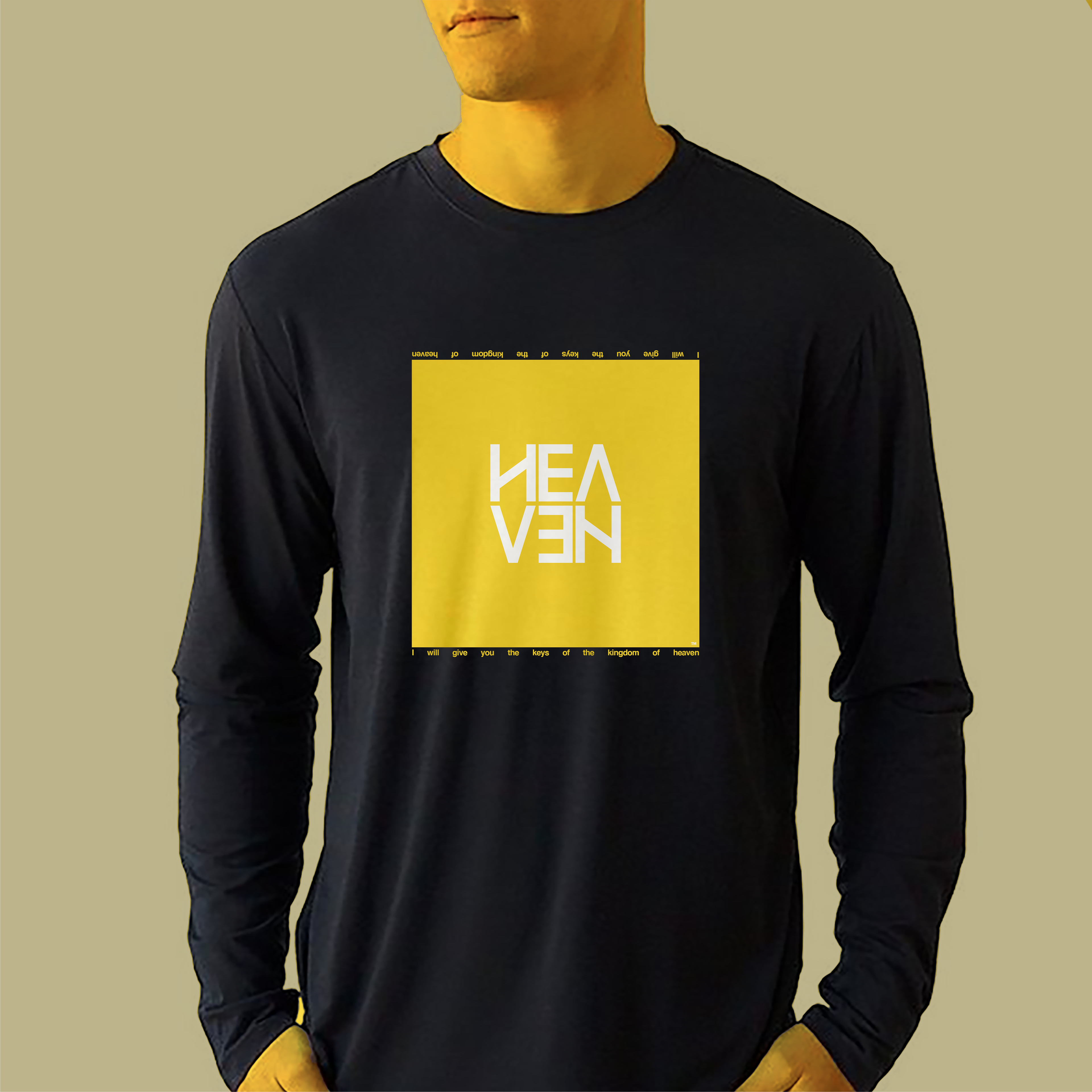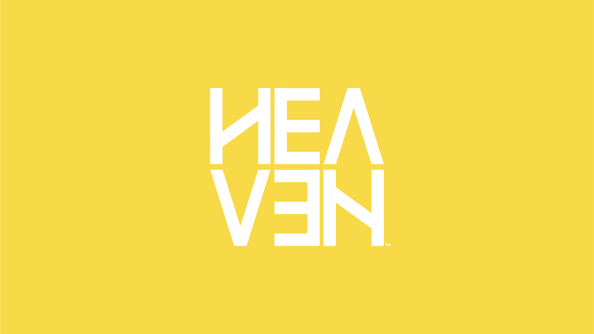
The "Heaven" brand was designed specifically for a line of apparel and merchandise. Reflecting on heaven being "above" led to harmoniously giving the letters a feeling of upward rising. The exception is the letter "V" which reminds the eye that heaven will eventually come down to earth. Reversing the second “E” suggest the illusion of reflection , as if “HEA” were reflected in a pool of still water. This suggested illusion leads the mind to think of heaven above and earth below.
Rendering the wordmark in a compact format makes it appropriate for both small and large formats on a wide range of apparel. Text and lettering seamlessly compliment the wordmark lending versatility and flexibility to the brand.